This is a magazine advert for The Killers. The name of the band is the main feature of this advert so that when people are flicking through a magazine, they see the name and can stop to look at it if it interests them. The colours selected for this advert (purple, pink, white, black, yellow and orange) have been chosen so that the advert looks appealing. If the colours clashed or didn't work well together, it wouldn't make people want to get the album/song that is being advertised. The name of the album is directly under the name of the band so that the audience can see that this is the name of the album, and the image that has been used on the advert is to go with the name of it. It also says that the album features the single 'Human', this has been done because it will have been released from the album and is a song that fans of the band will recognise and it will make them want to buy it. It might also make people who wouldn't normally listen to The Killers want to buy the album, they might have heard 'Human' on the radio and liked it so will then go and buy the album. It also has the record label at the bottom with a website. This is so that the audience can see what other artists are signed to the same record label as The Killers and potentially buy their music as well.
This is a magazine advert for Green Day. The name of the band has been put at the top of the advert so that it is obvious to the audience that this is the band the advert is advertising, it also allows them to know if they want to look at it. The name of the main single from the album is under the band name and is in a different font. This is to show that this is one of the main songs from the album. The bottom of the advert has an image of the 'American Idiot' album cover. This is so that the audience who haven't already seen the artwork can do, and it makes it easier for the audience to find it in a shop. The information on the poster is in the same colour scheme as the album cover (black, white and red). This is so that the advert looks good. If it was in bright colours it would be conventional of a pop album advert rather than a rock album advert. Black, white and red is also a colour scheme that is used a lot to advertise rock music and is the scheme used on the front of rock magazines. Like The Killers advert, it has the logo of the record label on it. The main image on the advert is of Billie Joe Armstrong because he is the lead singer of Green Day. He is also on the advert because the song 'Wake me up when September ends' was written by him about his Dad. He is also the person that people associate with Green Day because he is the front man of the band.
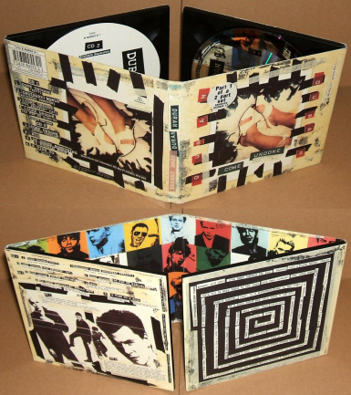
This digipak is by Duran Duran. There is a colour scheme for the outside, this is white, black and red/orange. This colour scheme continues on the inside of the digipak. The inside, however, it much brighter. If the bright colours that are on the inside where used on the outside, it could have made it look more like a pop album. This is why it is on the inside. The colour scheme that is used on the outside is used so it contrasts the inside. There are images of the artist on the inside which is conventional of a digipak.
This particular digipak has two disks, this is so that they can include the B side of the CD. This is done to appeal to the audience because they are getting more music for their money.
This digipak is by The War. The colour scheme that has been used (black, white and green) has been used inside and outside. This is to create continuity. It has also been done like this so that the inside and outside don't contrast each other. The image on the front is very basic. This is so that it doesn't draw attention away from the album name. The album title is the main focus of this album cover and this is shown in the font that has been used. The use of two different fonts allows the audience to differentiate between the name of the artist and the name of the album. This digipak only has one disk making it smaller than the above digipak. This means there isn't room for as much artwork. The artwork that has been used is the same as the outside artwork.
I have had a one-to-one with my media teacher. She watched my video and suggested some changes:
There needs to be more narrative - There needs to be clips of the boy making the project in the stop frame.This is so that it is clear that he is making it. I need to insert clips of the boy making the stop frame and then cut to the scene he has just done. I could also show his failures and successes.
In the montages at the beginning and end, there needs to be sound effects rather than it just being silent.
There needs to be more movement in relation to the Lego.
For this scene, the characters could swap places or they could rotate around
For this scene, I could have them moving (more fluently) and have a love heart moving behind them until they are inside it
I have had to change some of the video as I wasn't able to do some of the scenes with the props and set I had. I think this is a big improvement from my first attempt.
I have used backgrounds this time to make it look better visually. I have made my montages shorter than they were in my first attempt. I have also used a lamp for lighting rather than using natural lighting. This has improved the video as the shadows aren't moving like they were in my first attempt. I used a page turn effect as I wanted to create the effect of someone looking back through a photo album of their memories.
One thing I could improve on if I re-shoot is to try and make the lighting look less yellow. I also need to take some more images as I didn't quite have enough. I also realised once I had finished editing that some of my images are a little bit blurry. I also need to make my edits faster because some of them are too slow and make the movement of characters look clumpy. At the end of my video there is a loud buzzing sound for some reason. It is just meant to be silent like the beginning of the video. I checked my video before I uploaded and it was fine, so I think something has gone wrong in the uploading process.
Once I had finished editing I had a look at the theorists to see if any applied to my music video. Two theories I have found work with my video are Tessa Perkins' 'Stereotype' theory and Sven Carlsson's 'Narrative Structure' theory.
Perkins' theory applies to my video because the stop motion characters are wearing clothes that fit into the stereotype of a rock band. They are all wearing dark clothing and the girl has brightly coloured hair. This image they have fits into the stereotype and therefore conforms to Perkins' theory.
Carlsson's theory applies to my video because there is a narrative to my video. There is a narrative within a narrative. The main narrative is that a boy is making a stop frame animation for a school project. The other narrative is the story that is told through the stop motion. There is also some performance in the stop frame. This is when the characters are practicing in the garage and when they are on stage.
This is a bit of the behind the scenes. I wanted to show me moving my characters so that I could demonstrate how I got the images to make my stop frame. I have previously posted an image of one of the tripods I used and the other one I used, I showed in my filming on location video. I wasn't able to film a video of me setting up the tripods because they are both in fixed positions so all I did was attach the camera. That is why I chose to film the behind the scenes of the stop frame.
I filmed two videos to talk about what I did and why I did it. When I needed to change an idea, I stopped doing my stop frame and filmed what I was about to do. I also explained a bit about the changes and why I made them.
These are the responses I got from my survey. I got three responses, even though I was hoping for a few more, I got better answers because they weren't able to copy what someone else had said.