Monday, 21 March 2016

New Footage

I decided to film some footage on the beach for my music video as I felt that it would fit with the theme and feel of my video. In order to do this, my actor needed to have a costume change as his school uniform wasn't ideal for the beach. In my original idea, there wasn't going to be a costume change as it wasn't necessary. But with the slight idea/footage change, I have had to include one. This costume change is just my actor in a different coat, joggers and his wellies. This was a more appropriate and realistic costume for the beach footage as it wouldn't be realistic for him to go there with his uniform on.


Here is some of the footage I took while on the beach. I have decided to put this piece of unedited footage onto my blog to show what one piece of footage will look like. I filmed this bit a couple of times but have uploaded this version. I apologise for my singing!


After I edited my music video together, I had a look through all the theorists to see which ones applied to my product. The ones that apply are:

  • Tessa Perkins (stereotypes)
  • Blumer and Katz (Uses and Gratifications)
  • Sven Carlsson (Narrative structure)
  • Pam Cook (Narrative development)
  • Jason Mittell (Cultural categories)
  • Jean Baudrillard (simulacrum, hyperreality)
  • David Buckingham (Genre as change)
  • John Fiske (Representation) 

Similar Shots

When choosing what to include in my video, I had a look at some existing products of the same/similar genre of music. I wanted to have shots in my video that were used in other videos and would make the video conventional.


When deciding that I wanted the boy in my video to pretend to play guitar in my video, I had a look at McBusted 'Air Guitar'. This is a screen shot I took from the video to show why I have decided to use this in my music video.


In the stop frame, I want to show the band practicing in a garage because this is the stereotypical place people think of when bands are practicing. This is a screen shot from the 5 Seconds of Summer video 'Amnesia'. 


The main character in my music video is my little brother. I have seen a few videos that include young children in them instead of the artist. This is a screen shot from McFly's 'Love is on the Radio'. This is to mirror the part of my video where the boy is putting the camera on the tripod. The shot I will be using is a bit closer to his face than this one is but it is quite similar.


There is a part in the video where the two characters are on the porch. I tried to use an image of a house that is similar to this one. This is a screen shot taken from 5 Second of Summer's 'She's Kinda Hot'.


There is a few parts of the video that are going to be band performance. This is used in a lot of music videos in this genre. These two screen shots are taken from Green Day 'American Idiot' and 5 Seconds of Summer 'She Looks so Perfect'.


Saturday, 19 March 2016

My Music Video


Changes I need to make before the deadline (22nd April):

I need to have some more shots of the boy. The ones I had were used a lot. I need to put some effects on the parts where the boy is playing the guitar because they look quite plan at the moment. I need to try and make sure the clips of the boy all look different.

I did some more filming for my music video over the Easter holidays. For the footage of Alex making the stop frame, I was given the idea of making look like it was being recorded on a camera.

I watched a YouTube tutorial on how to add text as I thought this would be the best way to make it.


Tuesday, 15 March 2016

Idea for my video

I wanted to make my video have elements of 'behind the scenes' in it as I thought this would be better for the narrative than just having it all as a stop frame. I found a couple of existing music videos that have bits of behind the scenes in them.


I thought showing elements of behind the scenes was quite unconventional which works well with my video as it breaks the usual conventions of a video in the pop/rock genre.

Cameras


Tuesday, 8 March 2016

Making my Advert & Digipak

While I was making my advert and digipak, I was looking at some existing products to get inspiration for my products. I knew I wanted my digipak and advert to look similar but be in different colours. So I looked at existing album artwork. Because my video didn't have an artist featured in it, I had a look at covers that didn't have artists on them. When looking at the existing products, I found the covers that didn't feature the artists more interesting to look at than those that did. I looked at these six in particular to get some inspiration. My products conform to the genre stereotype by being abstract. I had a look at existing products from the same/similar genre to my music video and they all have at least two abstract covers. I find them to be more effective and more appealing than the ones that feature the artists in any way. I chose to make mine a real life image rather than a cartoon as I didn't want my promotional package to appear childish. So I used a real life image and used Photoshop to edit it.

Monday, 7 March 2016

Music Video Plan

I have made a plan of how I want my music video to be after speaking to my teacher who recommended some changes to it.

I am going to try and stay as close to this plan as I can when I do filming this weekend. Some parts might have to change depending on how they look. When I have filmed bits of the video in the past, they haven't looked how I wanted them to. So some changes might be made during filming, 

Physical Digipak


I printed off my digipak because I wanted to physically make it so I could see what it looked like when it was folded into the shape it would be if it was being sold in a shop. I didn't really have a colour scheme for my digipak. I tried to go for a theme over a colour scheme. The theme I went for was clouds because I used them in my advert so I used them in my digipak as well to create continuity. I have more colour in my digipak than I do my advert because I knew I wanted the digipak in colour and the advert in black and white. The only images in my digipak that are different are the images I took from my music video draft. I wanted to include these so it was obvious that they were part of one package. I also used these images to add more colour to my digipak and to have something else other than clouds or the image of the mountain. I did change the opacity of the images taken from my music video because I wanted my digipak to be in colour but I didn't want it to be bright. By changing the opacity, it just tones down the colour. The images that I thought were too bright, I made greyscale and put them behind the coloured images. I found that it looked better to layer the images by having the bottom image in grey and the top image in colour, rather than them both being in colour. Even when I changed the opacity, the image was still too bright and clashed with the other panels of my digipak so they had to be greyscaled. I made the two disks greyscaled like the advert so that the products were linked in multiple ways. 

The Digipak


This is what the whole digipak looks like together. I really like how it looks as a product. I might still make some changes to it, but this is what it looks like all together. I am really happy with how it has turned out. I think all the panels work well together as a digipak and have elements of the music video and the magazine advert which create continuity and show that they are all part of one promotional package.

The Disks


I have decided to make both the disks look the same because I don't want the digipak to have too much going on. I made them both black and white so that it was like my magazine advert. I wanted the disks to contrast the cloud background in that they aren't in colour. To make the image into a circle, I used the same method as I did for making the background image of my magazine advert. I then placed it onto my digipak and made it the right side by using 'Ctrl T' so that I could adjust the size. I did the same for making the two circles in the centre of my disks. When I had done one, I just duplicated the layers and moved it across so that they would look exactly the same.

I had a look at an existing disk from a CD.

I knew I needed some text and logos on my two disks but I wasn't sure what needed to be on them. So I used this one to give me an idea of what I needed to add to my disks .


Inside Covers of my Digipak


I wanted the two inside covers to have images taken fro my stop frame so that there was an obvious connection to my music video. I tried to pick images that were all different so that I could place them on top of each other. For the first one, I chose these two images to place on top of each other.


I changed the bottom image so it was grey scaled because I didn't want to use the original image which is in colour. 

When I put the two original images on top of each other, the green background clashed too much with the rest of my digipak, so I made it grey. I used this as the bottom image and put the colour one on top. I have changed the opacity of the coloured images. The coloured image is 75%. I have done the same for the other inside cover but I have used two different images. I wanted to use 4 different images for my inside covers all together because I didn't want it to become boring to look at as I have used the clouds background on three of the panels. 

Friday, 4 March 2016

My Digipak

I haven't finished the inside of my digipak yet, but I wanted to see what the cover would look like on the HMV website, Itunes and Spotify. These are the logos on my advert that are selling my digipak, so I photoshopped my cover into each of them. I also wanted to see what it would look like on a shelf in HMV.


I placed my finished digipak cover onto each of these different music sites because I wanted to see how it looked against other products and I wanted to see if it looked realistic as a product. I think my cover looks really good in all of these different music sites and it looks like a real product. It doesn't look unrealistic in comparison with other products.

Front and Back of Digipak


For the front cover of my digipak, I used the coloured version of my advert. I decided to make my digipak in colour because I wanted there to be continuity but I wanted there to be a contrast in the colours. The only difference to the cover of my digipak and the coloured version of my advert is that I have adjusted the opacity on the digipak as I wanted it to be toned down a bit as it looked too bright. For the back of my digipak, I used the snipping tool on my start menu to crop the original image so I could just use the clouds.

I then googled the track list for the album 'Reckless'. I then chose the font 'Orator Std' which is a font I used on my magazine advert. This was also used to add continuity. I had a look at the back of some existing CDs to see what information I needed.


From this, I knew that I needed to have a barcode, the record label logo and some information about the rights of the producer and about the distribution. I got an image of a barcode from Google, I had saved the record label logo as a seperate image so I just had to copy it across, then I wrote out the other information next to it.

Tuesday, 1 March 2016

Finished Advertisement


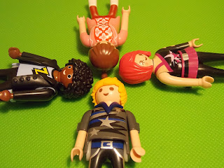
I am really happy with how my advertisement looks. I like how it breaks the conventions of a magazine advertisement as it doesn't fill all the space. I wanted to make my advert break conventions the same way my music video does. The use of Playmobil in my music video breaks all the 'normal' conventions of rock music and what is expected from a rock music video. So I tried to re-create this in my advert. I also tried to keep the colours minimal without making it look boring. I thought I was going to do it in colour as those were the adverts that stood out to me when I looked at existing products. However, I didn't think it fitted with the idea I had so I made the image black and white. I think this makes the image I have used look much nicer than it did in colour. I like that it is quite minimalistic but it is still interesting to look at and contains all of the necessary information without looking cluttered.

I wanted to see how my advert would look in a few different public places. So I used Photoshop to place my advert in a magazine, on the side of a bus stop and on a wall like a poster. I wanted to see how it would look in real places where it could be to see if it looks professional. I think my poster looks good in the three different places.